It is almost turkey times, friends! I cannot wait for some stuffing (it's my favorite).
First, I'd like to say I am having issues commenting on my own blog. I have seen your comments and appreciate the support, encouragement, and advice. Hopefully, I will have these technical issues resolved soon so that I can respond and send my warm regards.
I have done a little statistics in some of my science classes, but have not taken the class, yet. I believe it's on my schedule for one of the upcoming semesters. Therefore, I don't fully know about the types of statistical comparisons.
My week has been organizing my data into neat little tables that make sense. Also, I have had to collect some more climate data for one of my regions. I need to have a meeting with a mentor to help me understand statistically and graphically. I love math, but my least favorite part is making the graphs. Well, just complicated ones are challenging. Really my goal is to have the data really clearly put together so that when I meet with the mentor, they can say, "you are doing this statistically" or "you need to do (blank)."
Along with my data goals, I have been trying to do a little self-teaching in statistics. I am naturally inclined to learn math on my own, but without guidance it's....stressful.
Here's what I have been reading:
- Types of data sets
- Standard Deviation (I kind of already knew)
- Data analysis steps (should've started with this)
I found this amazing website call make me Analysts and it just clearly put out some steps for me to follow. I feel like I really needed that structure all along. From what I've concluded, I'm on the data cleaning step.
If anyone is behind or needs a little guidance like me, here is the website:
http://makemeanalyst.com/basic-statistics-for-data-analysis/
They also have great links to other pages that help you out with data analysis and statistics. It's been very helpful.
I was hoping to do a linear graph with temperature and cases overlapping, but I have been seeing a lot of Plague and weather data represented on scatter plots or bar graphs; thoughts mathematically knowledgeable peers?
Here's an interesting one that I derived from the CDC's website on their Maps and Statistics section for Plague cases. I don't think I have presented one that represents a longer timeline.
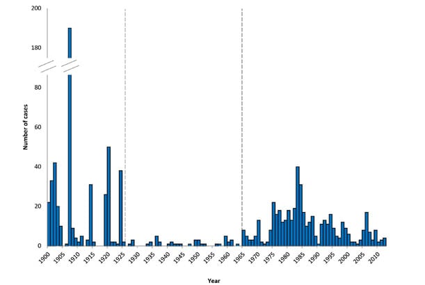
It poses a reminder that we are fortunate to live where and when we do. Many humans over the course of existence and in the present don't have access to the healthcare or living conditions we have. Despite the insanity in our country and people refusing to wear masks or socially distance, I am fortunate that I live in a time where modern medicine and technology is so advanced and much more understood than it once was. If you display symptoms of Plague a hasty diagnosis and efficient course of antibiotics can save your life. Unfortunately, that wasn't the case even one hundred years ago. Keep in mind, that spike that you see in the early 1900's is meek in comparison to the devastating toll of the Black Death in the middle ages. I think it's a suiting perspective to consider as we approach Thanksgiving. I am overwhelming saddened by the toll of this pandemic. However, I have taken moments everyday of it to reflect on the many things I have to be grateful for.
Have a wonderful and safe Thanksgiving, everyone.

I am unsure as to the commenting problem. I just tested on my own blog that there were no issues. I might possibly be the browser you are using?
ReplyDeleteAdditionally, your 'publish' button is the same color as the background. It is there in the bottom right (you will see your mouse change), but it is not visible.
The choice of chart style is heavily influenced by what story you are trying to tell and what data you have (continuous vs categorical), there is a bit of an art to it. Here is link you might find helpful: https://datahero.com/blog/2013/08/06/line-or-bar-graph/
There are line/bar graphs as well, where you might have the cases as bars overlain with a line graph using twin y axes! example: https://www.microsoft.com/en-us/microsoft-365/blog/2012/06/21/combining-chart-types-adding-a-second-axis/
I changed the color of the publish button! Thank you! That was so much help. I couldn't see it before, so I thought there was no option to publish the comment.
DeleteThank you for the help. I think I need to go with a line graph and I think I'm more on the continuous spectrum.
Forgot to add, the whole point of this program is to get this experience so you can learn what you need to learn. Glad you are enjoying the process.
ReplyDelete